Blog

Let me run my fingers through your...


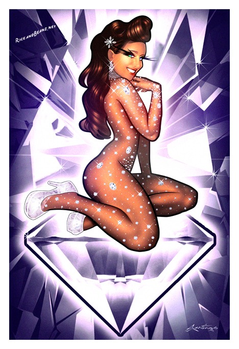
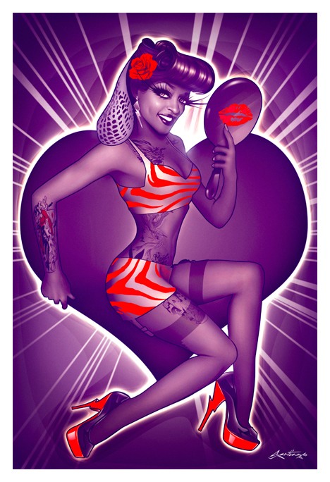
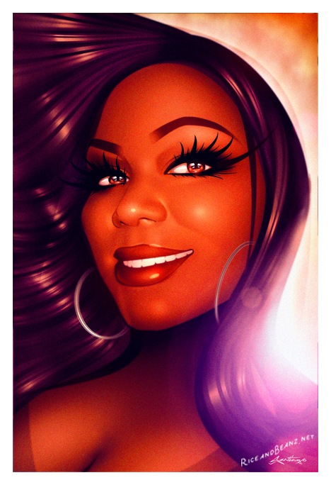
July's portrait of the month.


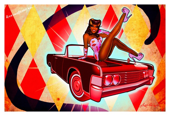
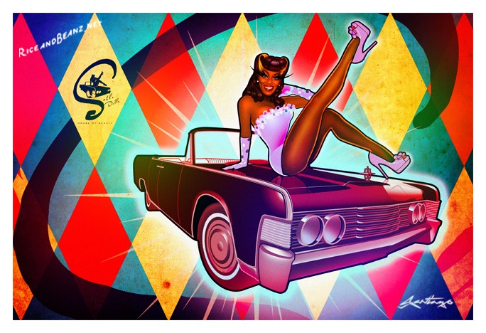
This time it's Tenille, a talented singer from North Carolina originally from Brooklyn. 

Since Tenille was going through a transformation in her life, like many women, she needed a small reminder of her value and grace despite feeling ungraceful. I engineered this artistic transformational glamour piece as a reminder of both her inner & outer beauty. 

Outer:

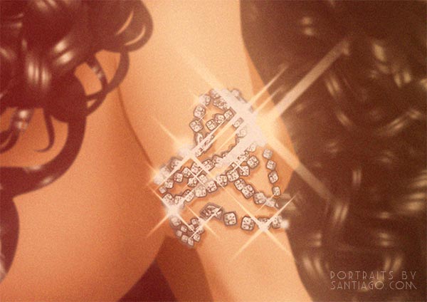
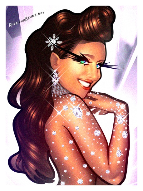
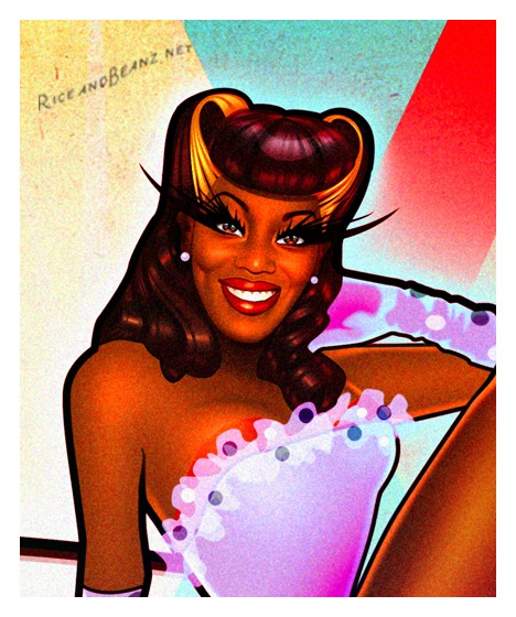
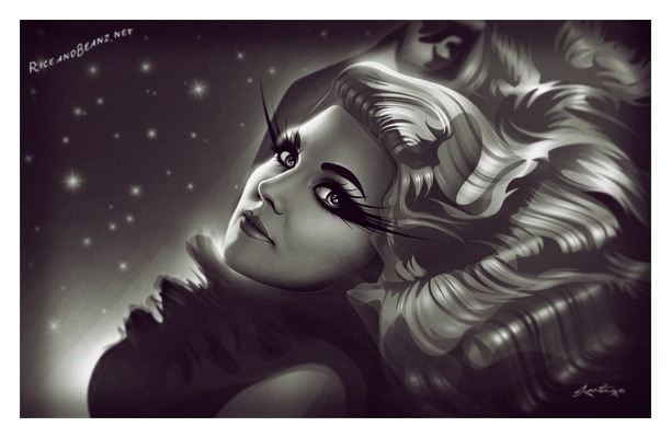
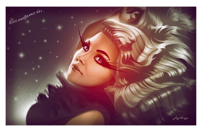
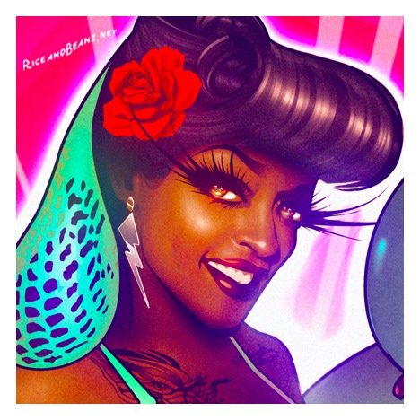
I really exaggerated her naturally curly locks to express the quote “The higher the hair the closer to God” and to give her a majestic regal vibe. The pose and the jewelry push a glamorous look that offsets the nudity in a tasteful way. It’s a glamour technique I’ve learned to deploy while living in Las Vegas and observing the stunning showgirls, specifically from the extravaganza ‘Jubilee” at Ballys. From the 1950’s to the 1990s each major casino had their own spectacular showgirl showcase. Sadly Jubilee was the very last of it’s kind until they closed a few months ago. The space is making room for yet another Circe De Soliel / EDM club thus forever erasing the showgirl culture from Las Vegas Strip. 

Inner:

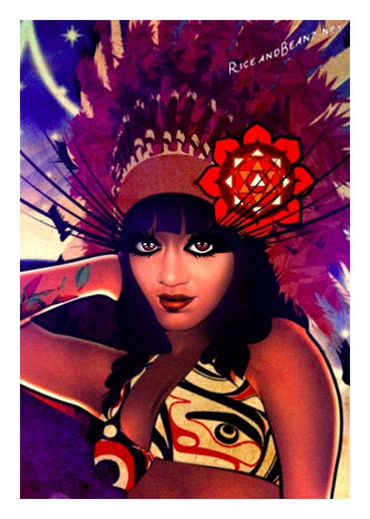
I also created an “Anahata” heart chakra flower hair piece. Anahata translates to “unhurt, unstruck, and unbeaten" in Sanskrit and is the 4th primary green chakra.  It’s considered the wellspring of self-nurturing, love, warmth, compassion, joy and is located in the center of the chest at the heart level.  In addition, I repeated the Anahata behind her in a hypnotic fashion. It fades away in a 1920s zig-zagging Art Deco flower pattern. It was my attempt to represent the importance being present, meditating, and how one zones out during a focused breathing session. Lastly, her curly mane is shaped like a giant heart to push the self love concept as strongly as possible for the days when it’s harder to embrace oneself.

In the end this commission was a cultural gumbo mix of pinup, showgirl, Vegas, 1920s jazz-age, and Eastern spirituality with a sparkly twist of self love and reflection. The title for this particular art piece is “Anahata” or the more fun and corny choice “Let my run my fingers through your heart chakra.”
Enjoy.

-Santi-

The art of making an endearing motherly canvas when mom looks like a deadly weapon.

The art of making this:

from this:


What happens when your client looks like a deadly weapon but wants an innocent family painting?

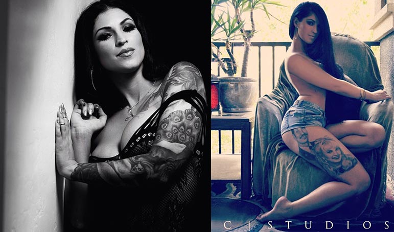
One of the challenges I have is often get clients who are drop dead gorgeous with “looks that kill - sex appeal”. Seems like a great challenge to have however it can be slightly problematic. Whenever I get hired to create a group, especially when working remotely, I usually request 10-20 photos of each person to see what works best in a group setting. When creating a beautiful warm family portrait art that conveys a mother's love for her children, these these glamorous women send me adorable happy photos of their kids as reference, but when it comes to her own reference photos, they often send sultry and sexy pics of what they think would work. The juxtaposition of sexy mom with innocent children leads to an odd visual and final product.
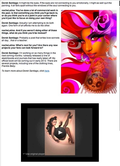
 

Long time friend and supporter and all around amazing woman, Amandita commissioned me to create a canvas portrait of her and her two beautiful kids. Since Amandita is quite the bombshell in real life, the majority of her modeling portfolio photos did not work well when posing with her kids in the pre production collage draft phase. Being the mad perfectionist and not resting until I found the right imagery, I ended up doing way more research and choosing a candid photo from her social media account that conveyed a loving and innocent facial expression for the final inspiration. It lead to a more cohesive connected loving vibe to the final art. What do you think?

Click link below to see the animated process.

Portrait of Tava.

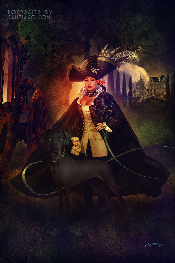
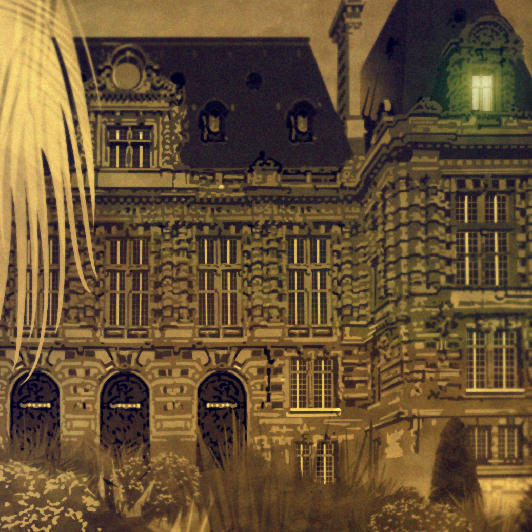
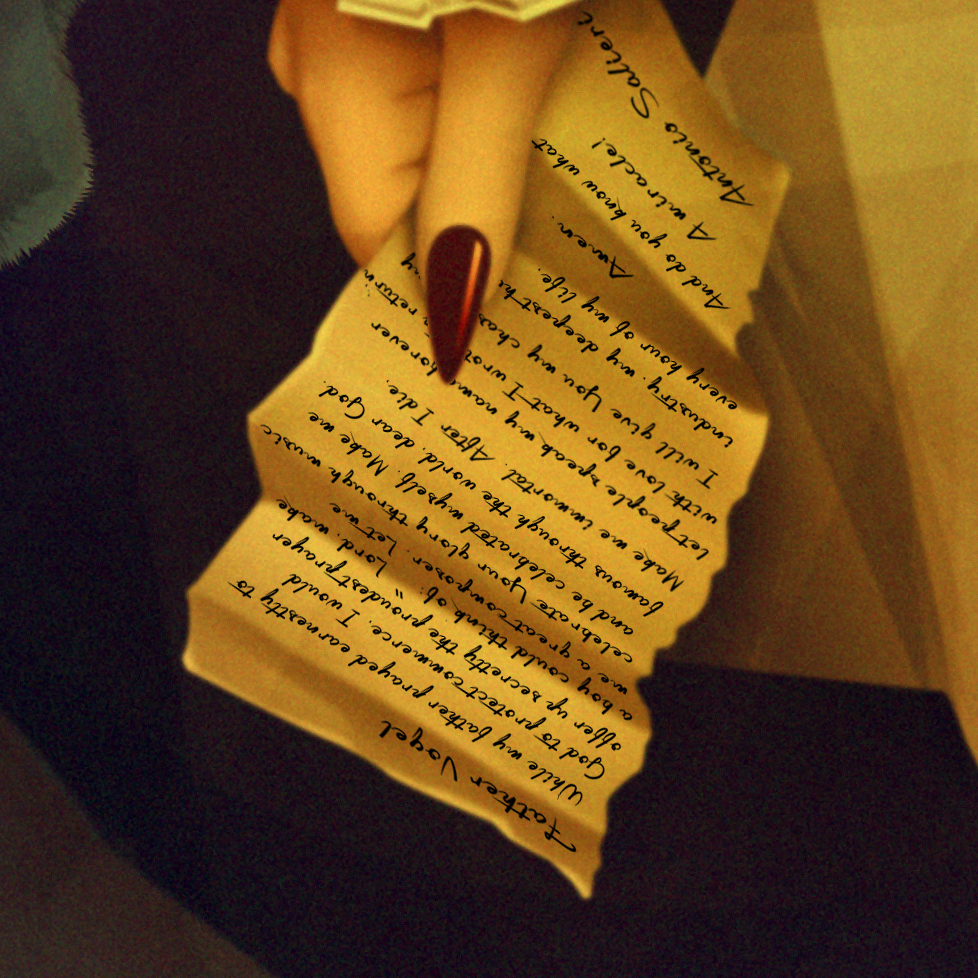
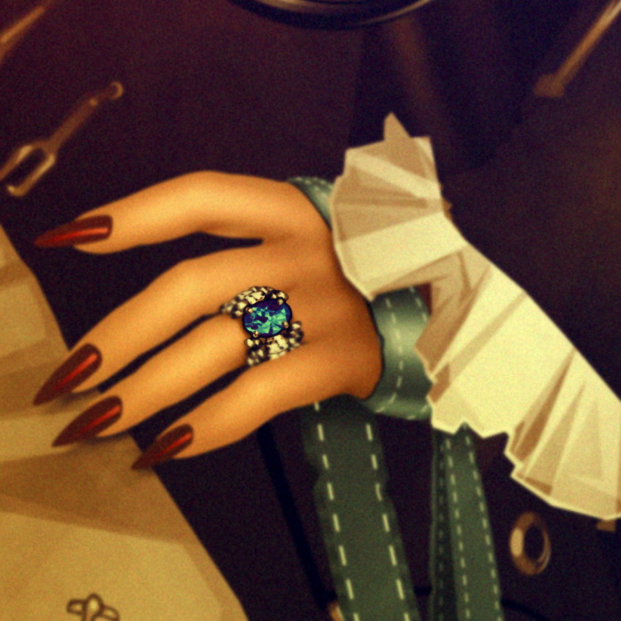
Amadeus 1790’s portrait styled art transformation of Tava and her Great Dane "Sterling" from Napa Valley, California. 36 x 54 inches in size. Hands down this particular piece is my most detailed elaborate complex transformation I have put my hand to.
Fascinated with long fingernails, Great Dane dogs, men’s French Revolution military uniforms, and an obsession with the 1980s’ Oscar winning motion picture Amadeus, Tava commissioned me to make something incredibly unique merging all her loves into something classic tasteful and historical. It also serves as a reminder of her of the special bond she has with her mother who she loves dearly that she now lives far away from. Rather than explain all the unique elements on the canvas, I think this time I’d leave the interpretations to the viewer.

The process took over 200 hours between research and execution and over 1400 layers to compose. Thank you so much for your patience Tava.

Better Face.jpg

So I'm having fun in the Burlesque world.

I've always been a fan of the genre, however never created any artworks burlesque related. However in January I was commissioned by The Burlesque Hall of Fame (BHOF) to create their poster art for their upcoming weekender in June. Being the OCD madman that I am when researching for a new project, I collected over 5000 images of burlesque history. It's no wonder I felt compelled to make this year's "30 days of" art project BurlyQ related. Click images below to see the full series. Enjoy.

April portrait of the month

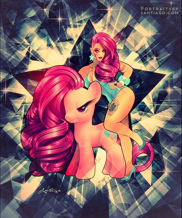
My Little Pony Pinup Portrait
Before after My Little Pony Pinup portrait

This months portrait post is of the animated Roxi Tart from San Francisco . Her personality inspired me to create a "Child of the 80s" pinup portrait art. Kiegan, her husband, was wanting to commission me for years. Last year he took the plunge asking to create something that would surprise his lovely lady. With no particular theme in mind, and after browsing Roxy’s Instagram, I was compelled to create something vivid I felt reflected her playful bright personality, yet sexy, true to pinup, and capturing her essence.


The transformation of a child. 1900s style portrait of Emma.

In the early 1900's, photography conveyed a sincere and innocent atmosphere for the subjects. Smiling with dramatic "say cheese" faces were something unheard of. With the evolution of portable cameras during the pass 100 years, an era of candid casualness has drowned out the sensitive tenderness early photography greatly showcased. Early motion pictures were influenced by theater, and early television presentations were inspired by radio presentations. In the same way early portrait photography was strongly influenced by the long art history of portraiture painting. Here is Edwardian era transformation portrait illustration art of Emma. Most of my retro portrait transformations are inspired by decades from the 1920"a to the 60's. However Inspiration is everywhere and yearned to create something a little different. I rarely do transformational art on children but was fascinated by studio portrait photography from this particular era. Notable trademarks were big poofy swirly "Gibson girl" hair curls, lots of flowers with a very shallow depth of field (center of face sharply focused with hair blurring out of focus, dark backdrops, transitional fades, and circular frames. Very minimal wash of color due to hand tinting black and white images. My challenge was to capture that same 1900's spirit in an illustration art format and still have it resemble my client's daughter. Tell me what you think. -Santiago.

Children's Portrait art
Eye detail portrait
Portrait art Before and after


Jazz Age / Harlem Renaissance couples portrait of Peg and Lee.

Harlem Renaissance

Since I am a huge lover of Art Deco and love the sophistication and dapperness ( just learned that’s a real word ) of the era, I thought it would be the fitting opportunity to create a really upscale portrait

I was inspired by the 1930s harlem dancer Margot Webb for her elegance and sophistication and chose to transform Peg into her, however whatever concept I chose to do, Peg insisted on having curls. So after a bit more research, I stumbled upon a hair style from one the great silent movie era actress, Norma Shearer. She sported finger waves that transition into curls sorta of like an elegant 1930s afro. Finger waves and curls. 

The Art Deco / Jazz / afrocentric characters and city scape are all inspired by the underatted African American Art Deco muralist Aaron Douglas, who pioneered a futuristic translucent flat afrocentric stylee. Sort of a black version of Diego Rivera, he beautifully illustrated the struggles of the oppressed, spoke on slavery, the elevation of the race, the beginnings of the NAACP in Harlem, while also transitioning into the new world of the, automobile, radio, jazz age, skyscrapers and mans quest to find identity in this new world. I also included the marquee of Harlem’s world famous Savoy Ballroom known for both it’s dance innovations and home of Jazz giants of the day, a place Peg’s grandparents used to frequent in their youth. Here is a before and after.

-Santiago-

And here is a few more details. 

And here is a few more details.


Harlem Renaissance details

A year in portraits.

A look into 90% of the portraits commissions  made for my clients through 2011. Happy New Year.

Featuring

Ana, Fadila, Yoli, Samara, Jane, Alyson, Sivan, Jennifer, Christina, Jane, Miss Feeny, Lucia, Ana, Jae, Carmen, Zoila, Elda, Tush, Bebe, Lola, Ela Family, Kelin, Tina, Shownine, Jessica, Vintage Vandalizm, Tessa, Jamie Principle, Frankie Knuckles, Eric Kupper, Betty Chantel, Brittany Kaye, Tonya Thomas, Carmen B, Tabatha, Michelle, Chena, Anki, Charlotte, Miranda, Lauren, Samantha, Nicole, Myrna, Lily, Marilyn, Boos Bakes, Charity, Delancie, Sol, Rene, Brooklyn, & Melanie.


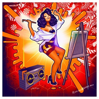
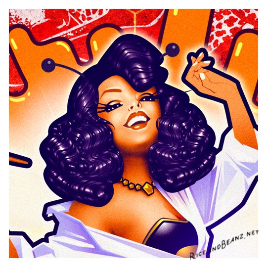
Lilly Bee Pinup

I was commissioned recently by one of my fans to come up with a design and illustration for her business. She wanted a sexy bumble bee complete with antenna and stinger basing it on an old pinup illustration called "Spilled Ink" by Joyce Ballentyne. It's a classic pinup art piece of a sexy pinup is creating art, yet having an "oopsy" moment and spilling ink. My client also loved the reinterpretation I used of great pinup master Enoch Bolles style of faces. She also requested a boombox with the Lilly Bee c haracter jamming out to it. Here is the end result.

Do it badly!

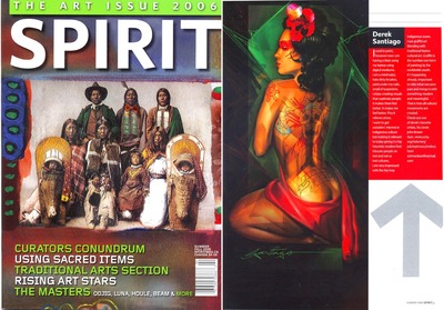
Here s an old school mini article I never posted. It from a Indigenous/ Native American magazine from October 2006. Ughh. I get so freakin' embarrassed reading any interview I take part in . I am super thankful for the attention but since I can't fake shit talkers, yet I feel like I am a  fake shit talker when reading these. Anyway this piece inspired by the lovely Tanya V was what really helped me find my direction as a pin up artist. I was starting to get back into painting again after almost 10 years of barely making a thing. Perfectionism, self critical sabotage will warp your mind body and soul. I stopped making art a few times because I thought I was never good enough. (the life long battle many of us share) But as I have slowly learned, If you love what you do,  Anything worth doing is worth doing badly.  I constantly hear from my fans wanting to see the "old Santiago" the wild cubistic painterly works again. (Trust me, you are about to be blown away by my upcoming works) but I had to take a detour for a few years and learn to make art because I love it, even if it comes out "badly" or not to certain standards. Letting go of unrealistic expectations has in the end made me 10 times more productive. Olus that :shitness I was afraid of was actually another style in me that was yearning to burst out, yet I surpressed it becuasr it did not fit the mold I saw in my head. It was better...

If it is worth doing, its worth doing shittily. Better shitty then not at all. Enough of my rambling.

Click image for detail.

Portrait for Chena from Texas.

She commissioned me to create a pin up piece that was sexy yet reminded her of how much she is loved. She also requested the shocking color combination of pinks and lime greens. Here is what I came up with. :)

black and white

detail